Bold Alliance
A network of small and mighty groups in rural states working to ensure a fair and just clean energy transition, from the Heartland to the Gulf.

The Bold Alliance fights pipelines and Big Corporations that threaten our land and water. They work with unlikely alliances of farmers, ranchers, fisherfolk, Tribal nations, and progressives to stop risky fossil fuel and industrial food projects with the grassroots style used to stop the Keystone XL Pipeline.


Brand Evolution
Bold Nebraska played a huge role in the #NOKXL fight. (Read more about the role design played here.) It was a historic win for grassroots activism on many levels. The formation of a new alliance of unlikely groups was the next phase for this movement of rural states and communities involved in the climate change struggle.
Our design challenge was to evolve the Bold Nebraska brand while elevating the Bold Alliance idea and allowing for multiple state-based organizations to exist underneath. To create a family of organization websites to connect the states together and provide visitor’s with the information needed to take action. The brands and websites were designed to work together and stand alone.
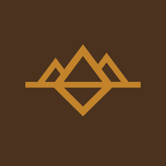
We kept the core concept of the original Bold brand intact. The “Bold Block” remains the cornerstone visual. We matured the Bold Alliance color palette and introduced state-centric colors and logotypes. The final set of deliverables we executed for each brand included a complete logo package for print and web, stationary, social media graphics, ad templates, and basic brand and social media guides. And then it was onto the website.


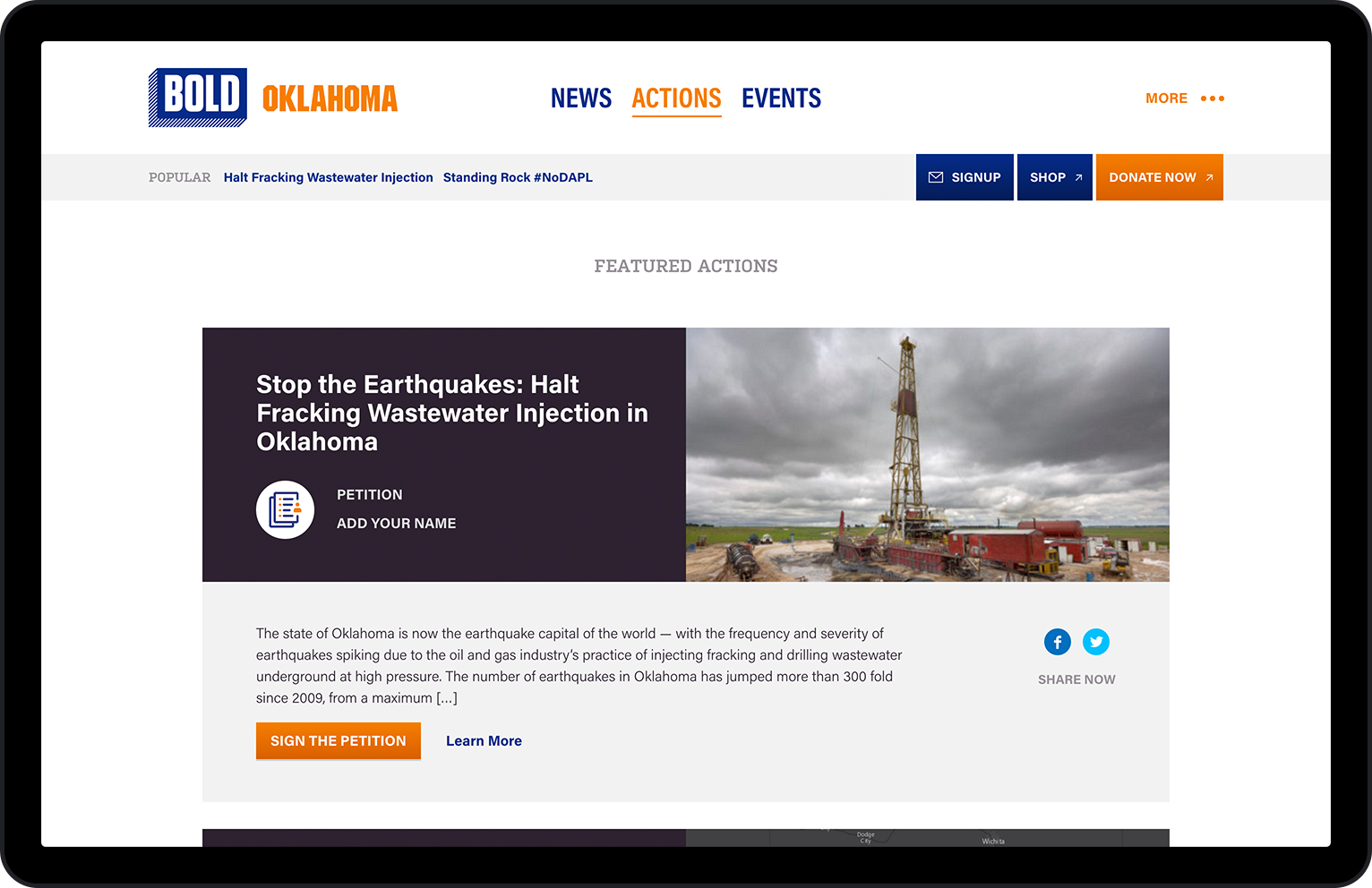
Website Alliance
Designing and developing a new website for each state organization was the biggest challenge of the project. From our initial vision document:
We want each website to offer a structured flexibility in terms of uniting the coalition together while still allowing each state’s issues to lead the way. We see this as an activist-centered theme that lays out the Alliance’s vision and informs visitors to the site with appropriate news and actions.
In 2013, the Bold Nebraska website was redesigned and developed to the standards of the modern Web. It was made fully responsive and migrated over to Wordpress for its CMS. It was a big step forward for the organization. The site became an important hub for progressive news and actions in the state and was the backstop for numerous campaign efforts ranging from the ever-changing #NOKXL fight to get out the vote efforts.

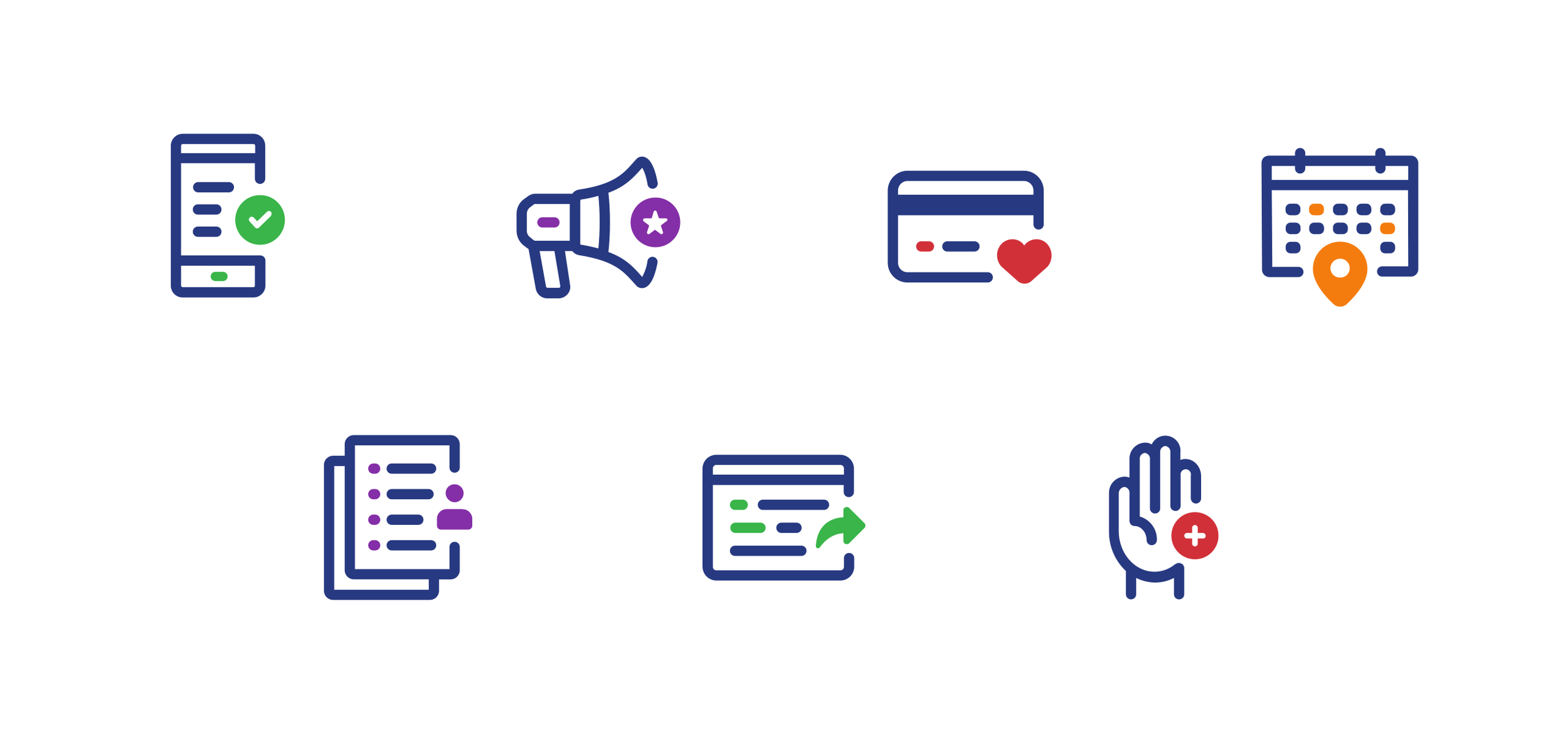
Icon Set by the impeccable Nicholas Burroughs.
Since then, as new alliances were forged outside of Nebraska, we learned a lot from the day-to-day use of the website. When we started the redesign this year, we kept in tact core aspects of the design—an image-centric UI, prominent calls-to-action, an emphasis on sharing, unique treatments for featured content, and distraction-free detail pages. But we also refined where needed and fixed things that didn’t really work that well.
The end result was a workhorse of a political activist theme for each state partner. The core navigation was determined to be the ever-changing content sections of the site—News, Actions, Events. Key Issues each got their own page with standard About info secondary to the core experience.
Yes, it’s light and responsive. And yes, we kept it on Wordpress. With Advanced Custom Fields, we were able to make virtually every part of the website editable in the CMS. On each landing page, featured content was treated a little differently and placed at the top. The biggest improvement was on the optimization of the homepage. Every feature was developed to be optional aside from a basic stream of content and the about section. Important campaigns or pieces of news were able to be highlighted in multiple ways in varying degrees of emphasis.
Finally, with an image required for each post type, we streamlined the sizing to make it easy on workflow. The Bold staff is not huge by any means. In the day-to-day, lots can be happening at any given moment. We implemented a standard size (1200 x 630) for the featured image in all cases. The old site had multiple sizes that displayed in a variety of locations. Now they were developed to be consistent across the board. A big time saver when a Bold team member would need to add a similar post to all state sites. With an image size based on social media standards, we also knew it would look good when shared to Facebook and Twitter.


Over the years, Bold has proven to be an extremely effective progressive group dedicated to clean energy and a bright future. They are without a doubt one of the best clients we’ve ever had. With the new brand and website presence now launched into the world, we are excited to see what lies ahead. And we’ll be ready with our services, whenever they need us.
This project is Action Backed. A collaboration with the Bold Alliance.
2016: Organization, Brand, Web
More Action Backed: