AO*
Hands-on planning, architecture, and interiors. By design.
With 35 years of experience in planning, architecture, and interiors, AO believes in a social and cultural responsibility to the built structures that come out of their collaboration and unparalleled service to their clients.
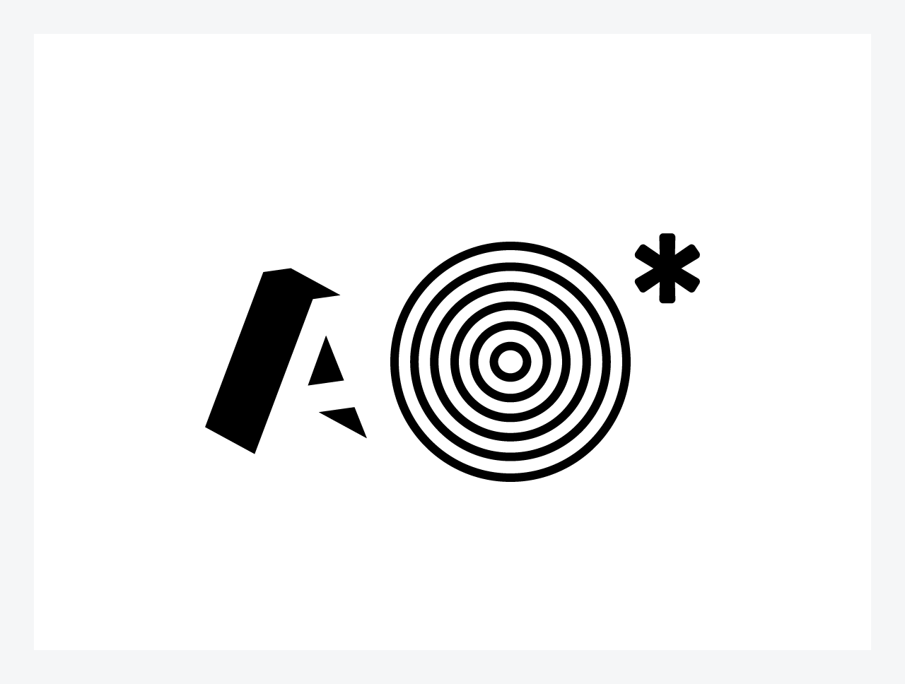
The new brand package for AO includes the logo and its variations as well as messaging treatments. Complete stationary set, new business documents, and a variety of signage was part of the final deliverables. The thinking behind the design for the logo follows:
Assembly required. The pieces or building blocks of an idea or a project. Picking things up, moving things around, looking at all angles. Dimension, negative space, overlapping, and shading adds just the right amount of meaning to something very simple.
The asterisk idea is used to highlight different brand attributes of AO and helps to define what AO is as a company.
Hands-On
Inquisitive
Empowered
Fresh-Eyed
Style Agnostic
Nimble
As a messaging tool, the line is used to connect the A and the O to further define the company as it relates to projects, company values, and other general types of communication.
Collaborators
Throughout the process, I worked closely with the Director of Marketing for AO Jenni Shukert. We had regular meetings with the four partners, especially in the beginning. The project began after a brand immersion study executed by The New BLK.
2015–2016: Brand, Print
More Print:


