DCCC
The D-triple-C is a Democratic committee committed to electing Democrats to the US House of Representatives.

Rebrand & Build
From all across the country, both near and far, Democrats are uniting to push America forward. We are amplifying our strengths by coming together. We’re diverse, we’re strategic, we’re organized, and we’re not afraid to be bold (and blue). We have the momentum, the data, and the will to unite in order to win races and lead the people’s house to serve the many, not just the few.
The core logo is made of thick lines in different lengths and shades of blue to represent our Democratic leaders who come from many different backgrounds, with many different ideas, and work together to serve a common purpose.


Change Is Good
The Process
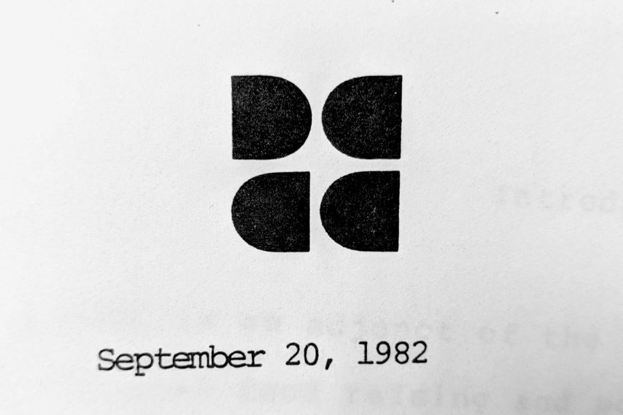
End of 2017 saw the beginning of a conversation about the rebranding of a DC staple of the Democratic party: The D-trip. They were in need of a modern, thought-through, cohesive identity. A banner behind which supporters could rally. There was a need to go from competing style guides, a confusing array of color palettes and typefaces, and an outdated logo to something more modern, strategic, professional, and focused on partnership.
Based in DC, creative director Lucas Fleischer brought together the designers to make it happen. To work closely with the internal creative team at the D-trip, he tapped two progressive, passionate Democrats, Daphne Karagianis in Chicago and myself out of Omaha. We were more than ready to craft a solution to their problem for today that will serve them well into tomorrow. A logo to embody what it means to be Democrats in the post-Obama era.
This is the only political committee in the country whose principal mission is to support Democratic House candidates every step of the way on the path to victory. The D-trip is about winning races, near and far, and bringing Dems to DC to do the people’s work.
The process to get from a DC-focused, typical political logo to something new was fairly typical. With a briefing from the leadership team in hand, we moved forward with a series of member interviews and surveys to get a broad sense of the current state of affairs. Common refrains we heard were that the D-trip just isn’t about DC, it’s about the members that come here to make change. And when it comes to Democrats, we’re hopeful, inclusive, youthful, and organized and we care about equality and moving the country forward.
From there, the design work included five initial design packages and a back-and-forth with a couple more options. We eventually landed in a spot where everyone involved felt good with locking it in.
The following are mockups of the chosen identity used in our presentations.


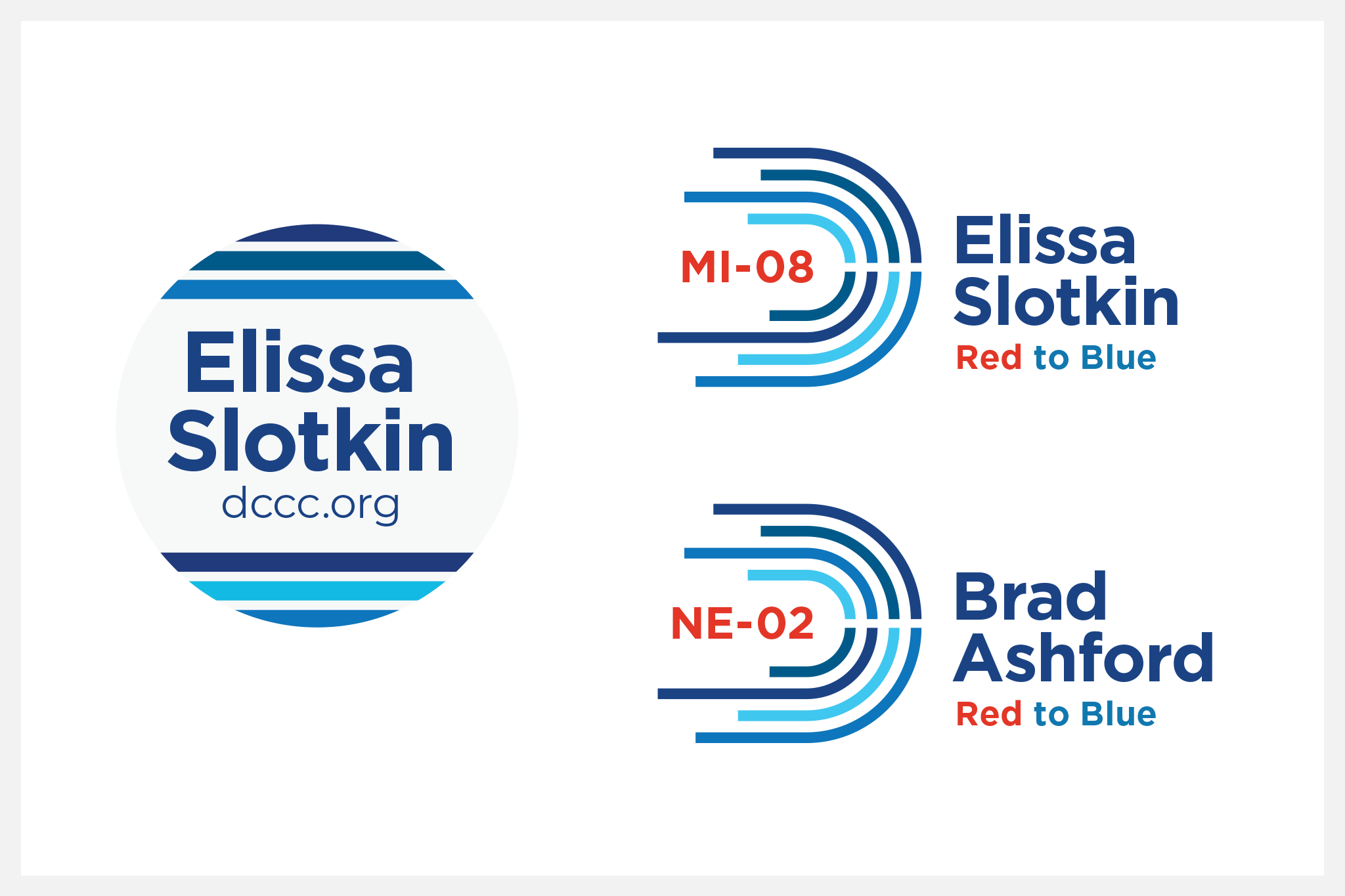
Note: Brad Ashford, a Nebraska Democrat, was my congressman in 2014–16. He ran again in 2018 and everyone assumed he’d make it out of the primary. That was not the case. He lost to a more progressive candidate. A woman named Kara Eastman who brought new voters into the fold. She ultimately lost to a vanilla Republican named Don Bacon. He’s not a terrible racist like other House Republicans but he did vote to take health care away from millions of people, which is the main reason I despise him. I very much wish Kara would’ve won but NE-02 has been gerrymandered all to hell since its electoral vote went to Barack Obama in 2008. Republicans here, like the national party, are into rigging the system in their favor. In just this last election they got term limits on the ballot for Lincoln’s mayor, an office currently held by a Democrat. It passed and now the guy, Chris Beutler, who has led Lincoln into the 21st century with a big, bold vision can no longer run. Just goes to show you, today’s GOP, no matter where you go, is full of anti-democratic partisan hacks who either cheat or change the rules to stay in power. The whole party is fucking horrible and every last one of them should never be voted for ever, ever, ever again. #VoteDemocrat


An Extended Visual System
The Deliverables
Looking back on the process with some distance, I’m proud of the work this scrappy group of independent collaborators put together. The final package delivered to the D-trip included a detailed style guide, an insane amount of logo files and variations, and a whole bunch of design assets. Anything we could think of that was helpful for getting the new identity out there into the world in the way it was intended, whether in 0.5 inches of print space or digital down to 32 pixels square.
We really got after it in the final phase of the project after everything had been approved by the powers that be. Being the diehard Dems we happen to be, we were super stoked to put our blood, sweat, and tears into this one. After we wrapped, we sat back, relaxed, then volunteered, and prayed to anyone who would listen that the Dems would be propelled by a blue wave leading them to take back the US House of Representatives from one of most ruthless and yet ineffective group of Republicans we’ve seen in the modern era.
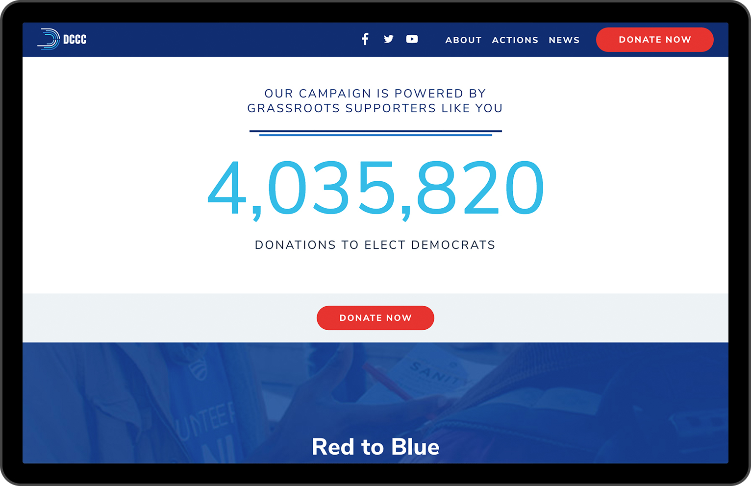
The following are some of the final design assets featured in the style guide delivered in April 2018.


Hadouken!!!
What Folks Are Sayin’

After launch, we found on Twitter the above mashup featuring Ryu of Street Fighter 2 in Hadouken pose with the new logo. Wasn’t something we had thought of but we found it quite appropriate nonetheless. Facebook had its share of insightful, constructive commenting the platform is known for.

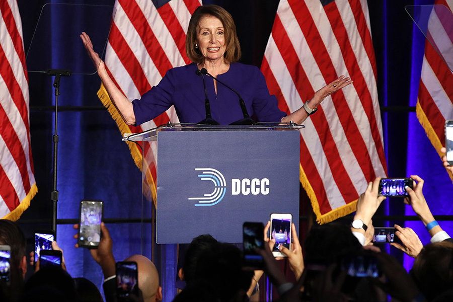
Only a few misconceptions. Sadly none of us are overpaid, this isn’t the DNC, and a picture of Bernie wouldn’t reproduce well in small sizes. Also, the people who did the branding weren’t the same people who work on policy, just FYI. Although, it is funny to think about Nancy Pelosi walking us through her initial concepts.
The team at the D-trip was thrilled. They were excited for the new logo and the system that accompanied it as they prepared for the epic 2018 midterm race. From their creative director Kate:
The more I make use of everything you sent over—not just files but also guidance, expertise, and experience—the more we appreciate how much work and care has gone into everything. You really set us up for success.
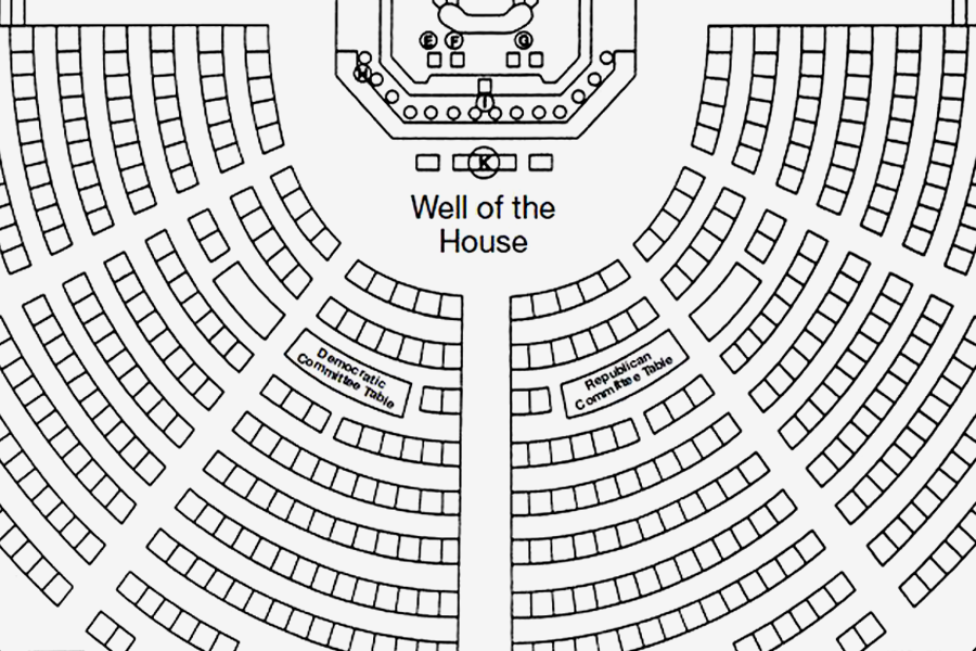
Yes, the logo is simple. We opted for no stars or checkmarks. It does resemble the seats of the House, which Democrats firmly took back on November 6, 2018.
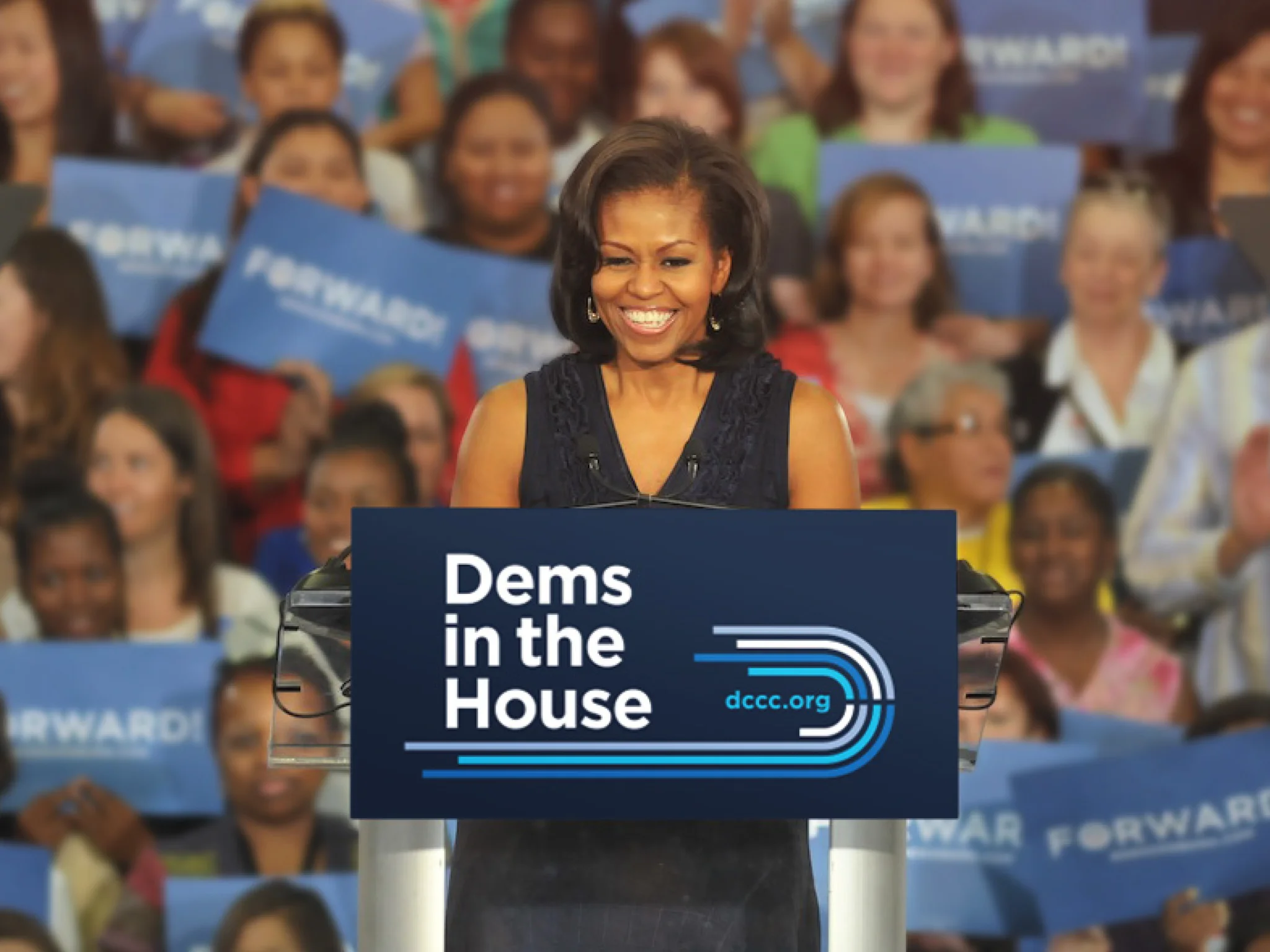
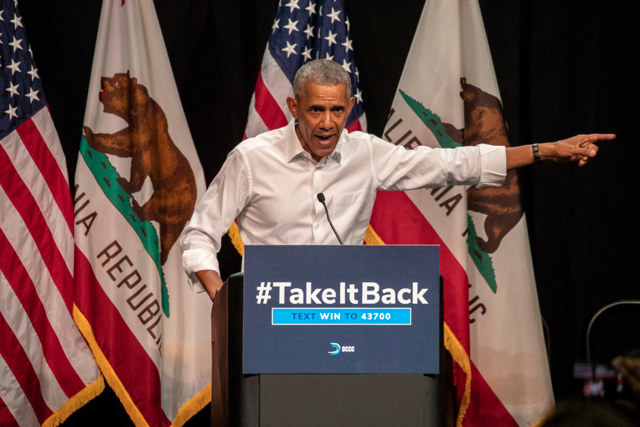
At the end of the day, the D-trip is about taking all of those diverse, Democratic voices, unifying on the campaign trail, and then winning races from Virginia to Colorado to Florida and all the way to California. Which they certainly did. Looks good on a podium, too.
A collaboration with Lucas Fleischer and Daphne Karagianis.
2018: Brand, Campaign, Print, Social
NBC NEWS
Democrats won the House with the largest midterms margin ever
More Brands:


